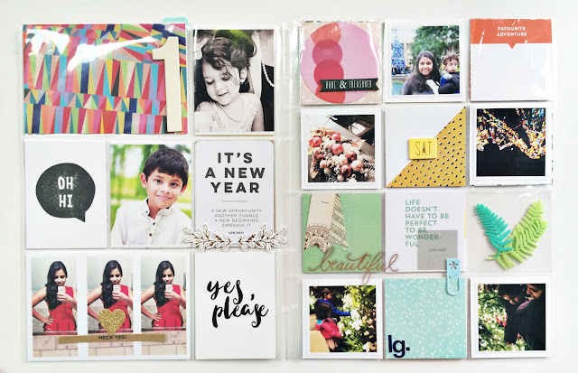
Project Life managed to hook me back in this year somehow. I just love all the cards and kits and everything. I'm always so happy when I look through old albums at all the memories we have recorded.
This year I was very lucky to have some nice family photoshoot pictures (from September) to use on the title page.
A few pops of color balanced with a lot of neutrals - kraft and black and white patterns. That yellow five card feels like it was made for us.
I love this funky numeral patterned paper. I stamped the H on cardstock and fussy cut it off.
I made a back to the cover page too because, well, I can. (Still better than in 2014 when I made three title pages apparently).
I decided to be really self indulgent and include my favorite recent selfie. I don't take a lot but c'mon, that dress!
Another really fabulous colorful card on this page. The rest are pretty simple black and white cards. Since we are Heckers, I had to use the "Heck Yes!" word strip on here. My style has definitely gotten much simpler over the years but that's okay.
The other side of this page is a lot more colorful, and I like how it all comes together. I think all the literal white space helps.
I have caught up with the first few months of project life and will be sharing more ideas here soon.


Very nice pages!
ReplyDelete